Overview
In today’s world of web design, flexibility is key because people access websites from all shapes and sizes of devices. Whether your website needs to look good on a huge desktop monitor or a tiny smartphone screen, it needs to be effective on both. This is where CSS breakpoints and CSS headers come into play: together, they form an essential foundation for creating responsive and visually appealing websites.
Learn what CSS breakpoints and headers are, how they work, and how you can use them to build beautiful, functional websites that adapt seamlessly to any screen size.
What Are CSS Breakpoints?
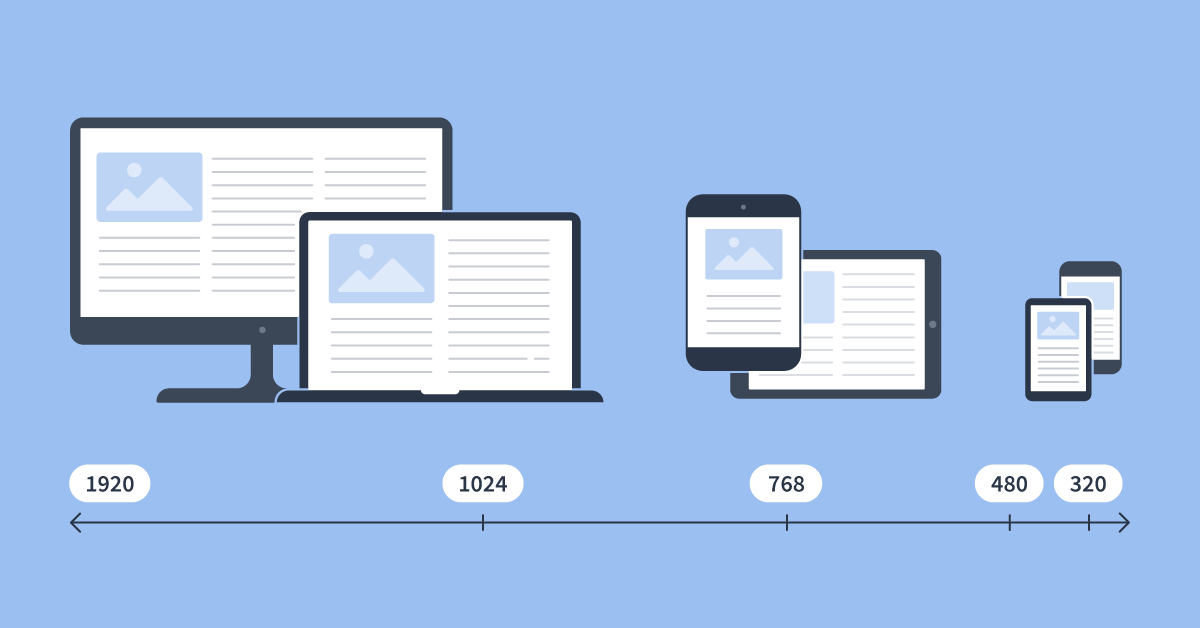
CSS breakpoints are those points or positions in your website’s layout where the design will change according to different screen sizes. They’re basically conditions defined in your CSS code to ensure your site is responsive on various devices.
Why CSS Breakpoints?
Breakpoints enhance the user experience. Your website is ensured to look and work great on all devices.
- Mobile-First Design: Breakpoints allow you to favor mobile users, which usually constitute the great majority of visitors.
- Dynamic Layouts: They enable you to make certain elements change positions or even resize based on the screen size.
Using CSS Breakpoints
CSS breakpoints are commonly defined with media queries. A media query is a CSS tool that applies styles under certain conditions, such as screen width or height.
Here’s an example:
/* Default styles for small screens (mobile-first approach) */
body {
font-size: 16px;
}
/* Styles for larger screens */
@media (min-width: 768px) {
body {
font-size: 18px;
}
}
@media (min-width: 1024px) {
body {
font-size: 20px;
}
}
In this example, the font size increases as the screen width gets larger. The breakpoints are defined at 768px and 1024px, which are common sizes for tablets and desktops, respectively.
Commonly Used CSS Breakpoints
While there are no hard rules, these breakpoints are widely used:
- Small screens (mobile): 480px or less
- Tablets: 768px
- Desktops: 1024px or higher
- Large desktops: 1200px or higher
What Are CSS Headers?
Now let’s take a look at CSS headers. Headers form the top of a page and could have elements within them such as:
- Navigation menus
- Logo
- Page titles
- Hero images
With CSS, you can style headers to highlight these even further while maintaining functionality and responsiveness.
Why CSS Headers Matter
- A beautiful header attracts the visitor’s attention right away.
- Navigation Headers offer navigation support to different sections in your site.
- Branding Headers help represent your logo as well as other brand elements.
How to Create Responsive CSS Headers
Here’s the detailed step-by-step guide to creating a responsive header:
- Basic Header Structure in HTML
<header>
<div class=”logo”>MyWebsite</div>
<nav class=”menu”>
<a href=”#home”>Home</a>
<a href=”#about”>About</a>
<a href=”#contact”>Contact</a>
</nav>
</header>
- Header CSS Styling
Style the header with CSS:
header {
display: flex;
justify-content: space-between;
align-items: center;
padding: 20px;
background-color: #333;
color: #fff;
}
.menu a {
color: #fff;
text-decoration: none;
margin: 0 10px;
}
- Dealing with the Header Responsiveness using CSS Breakpoints
Add media queries to alter responsiveness for a smaller screen.
@media (max-width: 768px) {
header {
flex-direction: column;
text-align: center;
}
.menu {
margin-top: 10px;
}
}
In this scenario, the header is using a horizontally styled layout that becomes vertical at screens with a size below 768px.
Using CSS Breakpoints and Headers Most Effectively
- Mobile First: Design for small screens first, then add styles for larger devices.
- Testing on Real Devices: Do not limit your testing to emulators; test designs on real devices.
- Fluid Design: Combine breakpoints with fluid units such as percentages or em for a fluid layout.
- Simplify the Header: Do not overcrowd the header with too many items.
- Consistency is key: Use the same styling at breakpoints for a cohesive look and feel.
Conclusion
CSS breakpoints and headers are the fundamentals of responsive design. Breakpoints allow the layout to adapt seamlessly across different screen sizes, whereas headers feature important navigation and branding.
By combining these two powerful tools, you can create websites that not only look stunning but also deliver an excellent user experience on any device. Whether you’re a beginner or an experienced developer, mastering these techniques will elevate your web design skills and ensure your projects stand out in 2024 and beyond.


